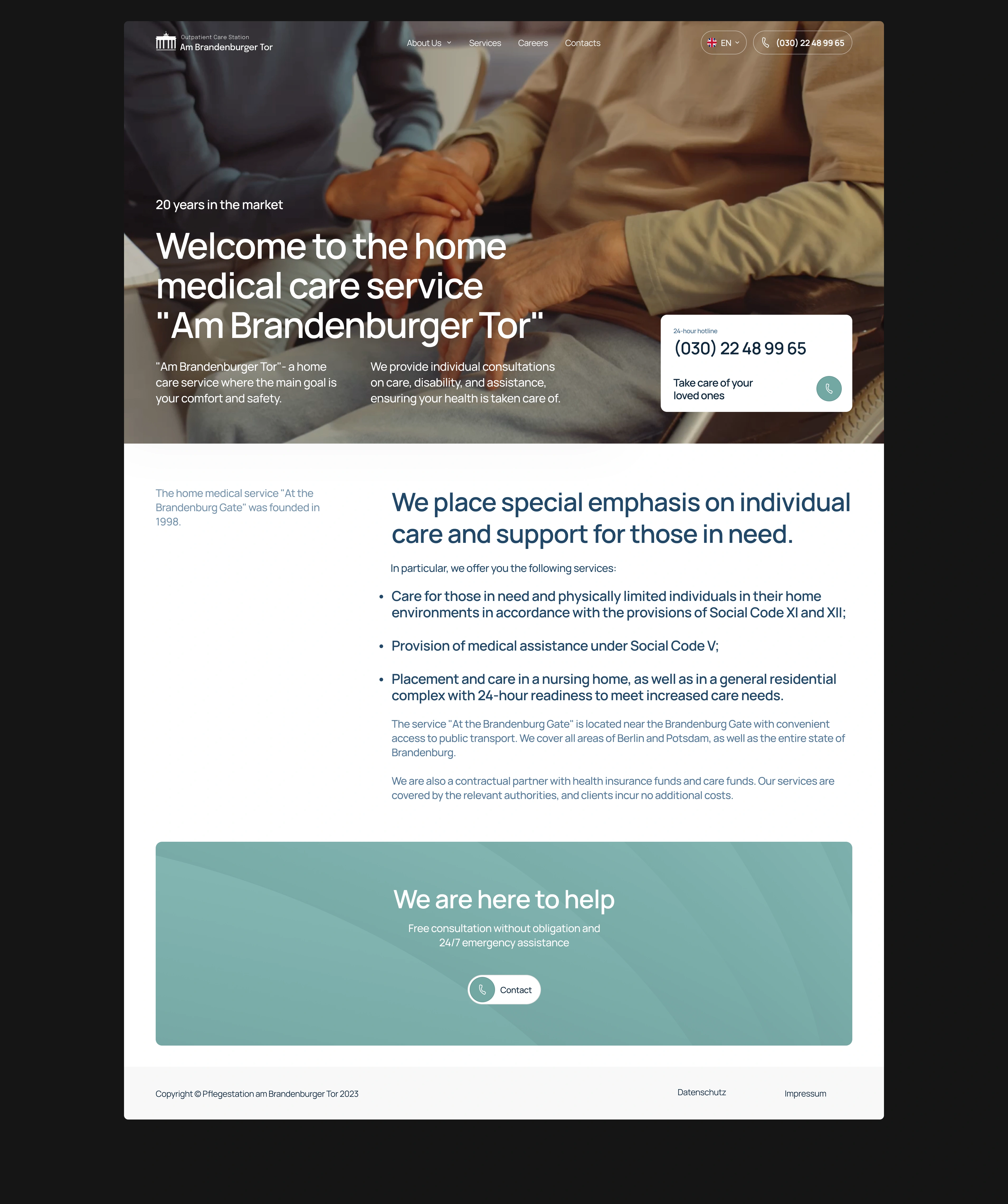
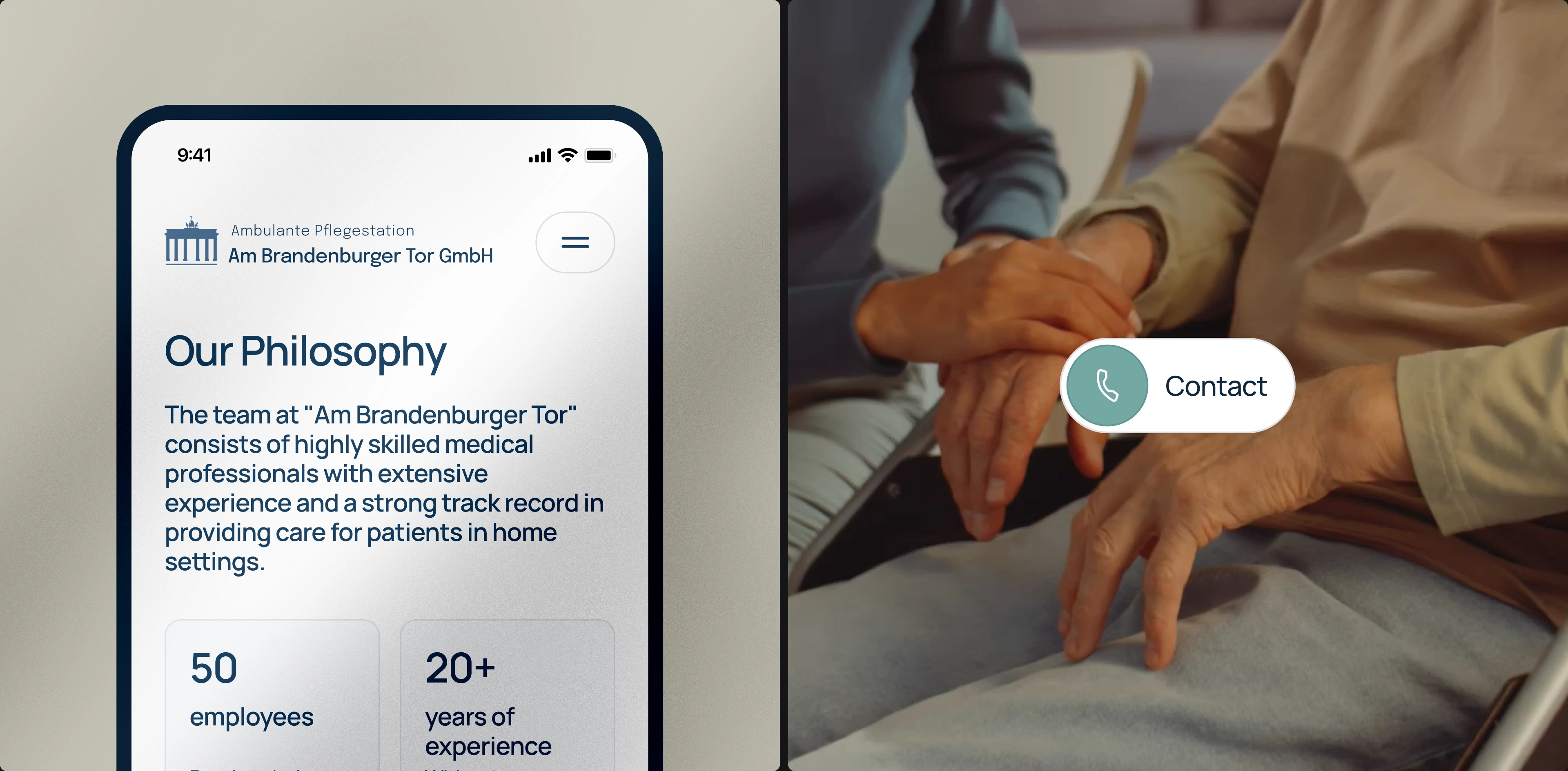
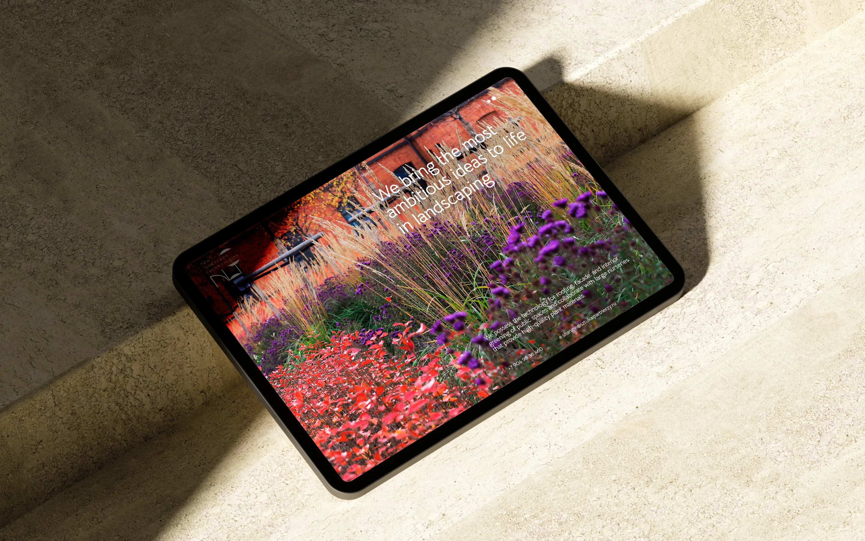
At the Brandenburg Gate — this is a service focused on caring for people and improving the quality of their daily lives. As part of the project, a website was developed that creates a sense of safety, support, and human attention — key values for the service's target audience.
Services:
- Brand Identity
- Corporate Website

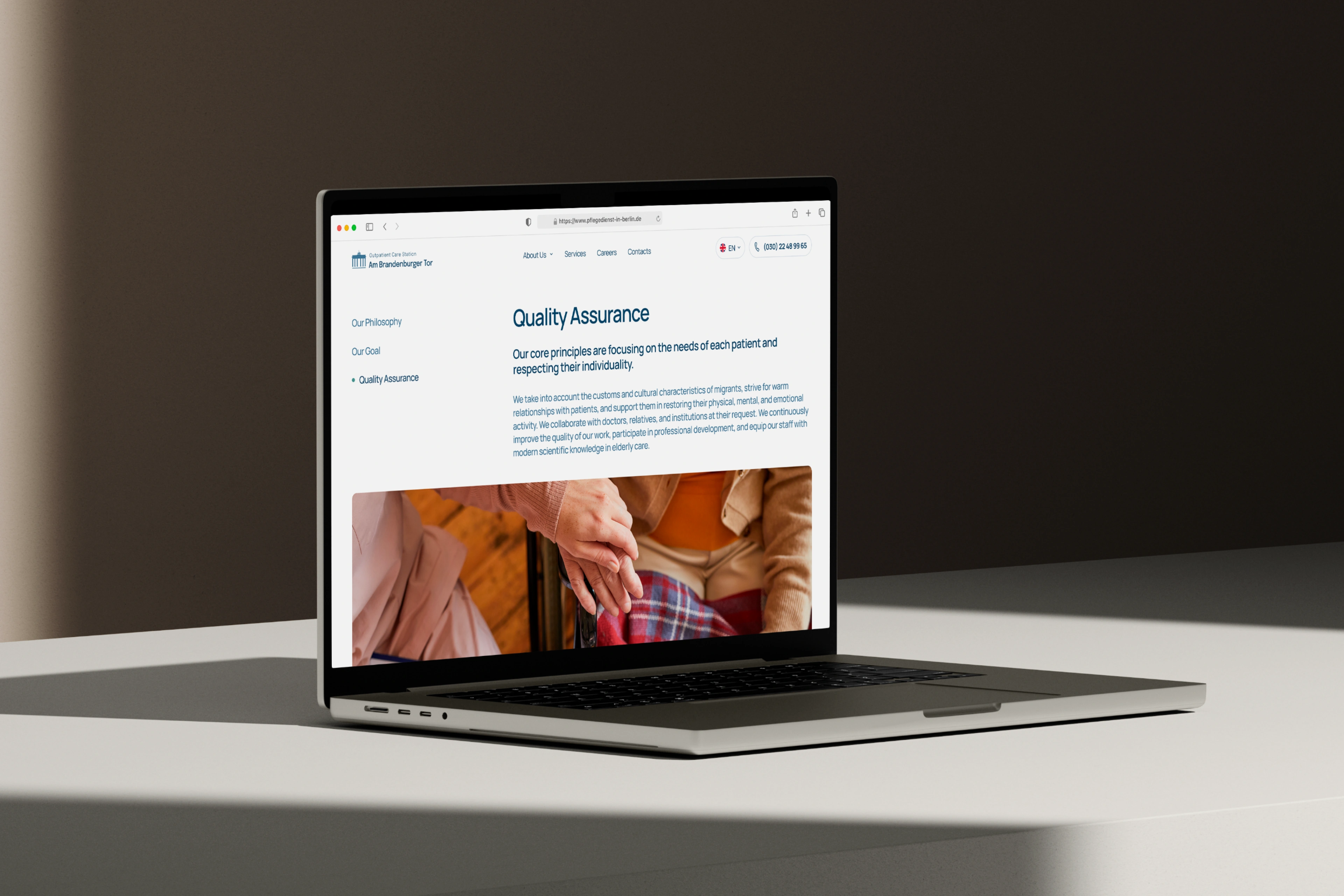
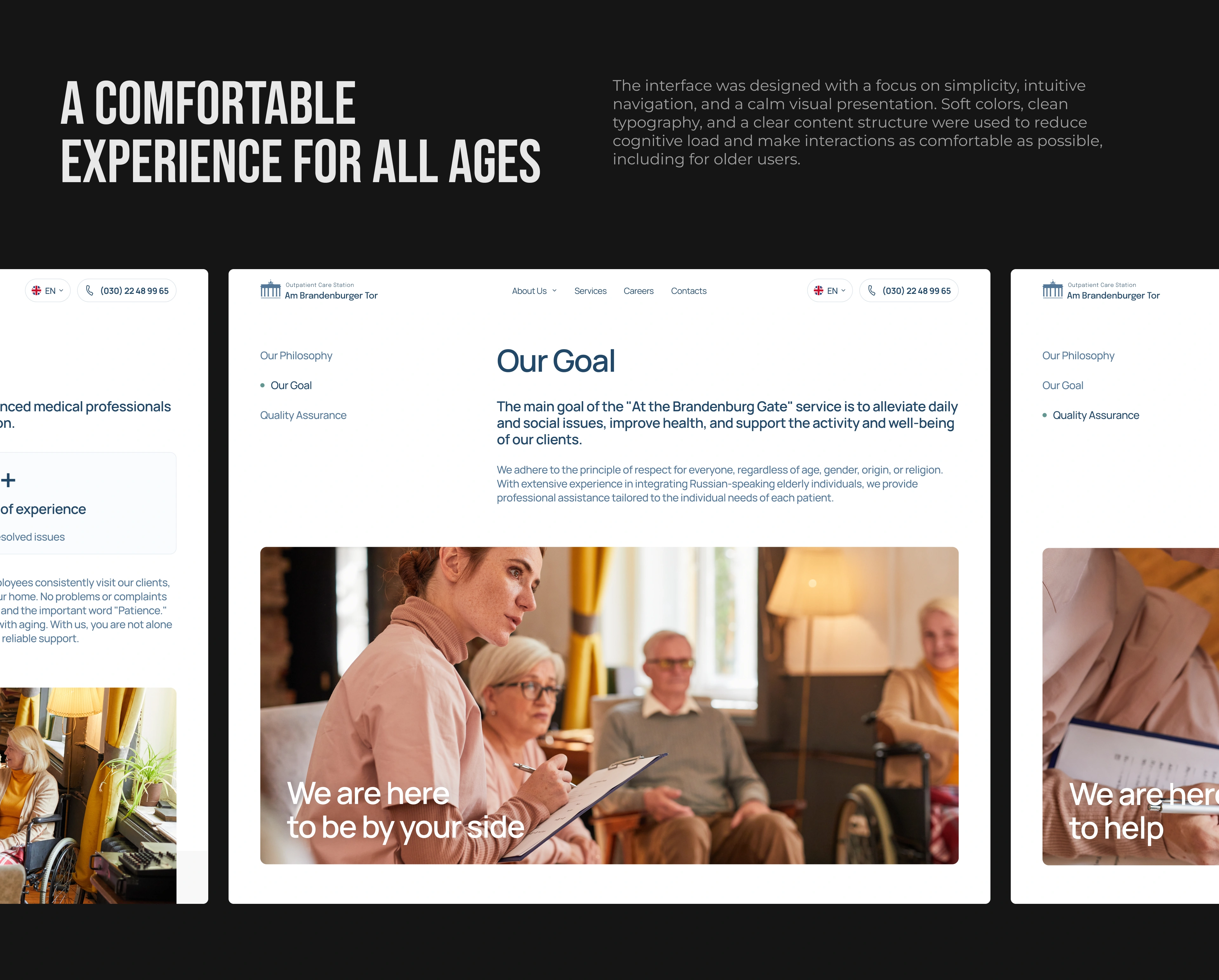
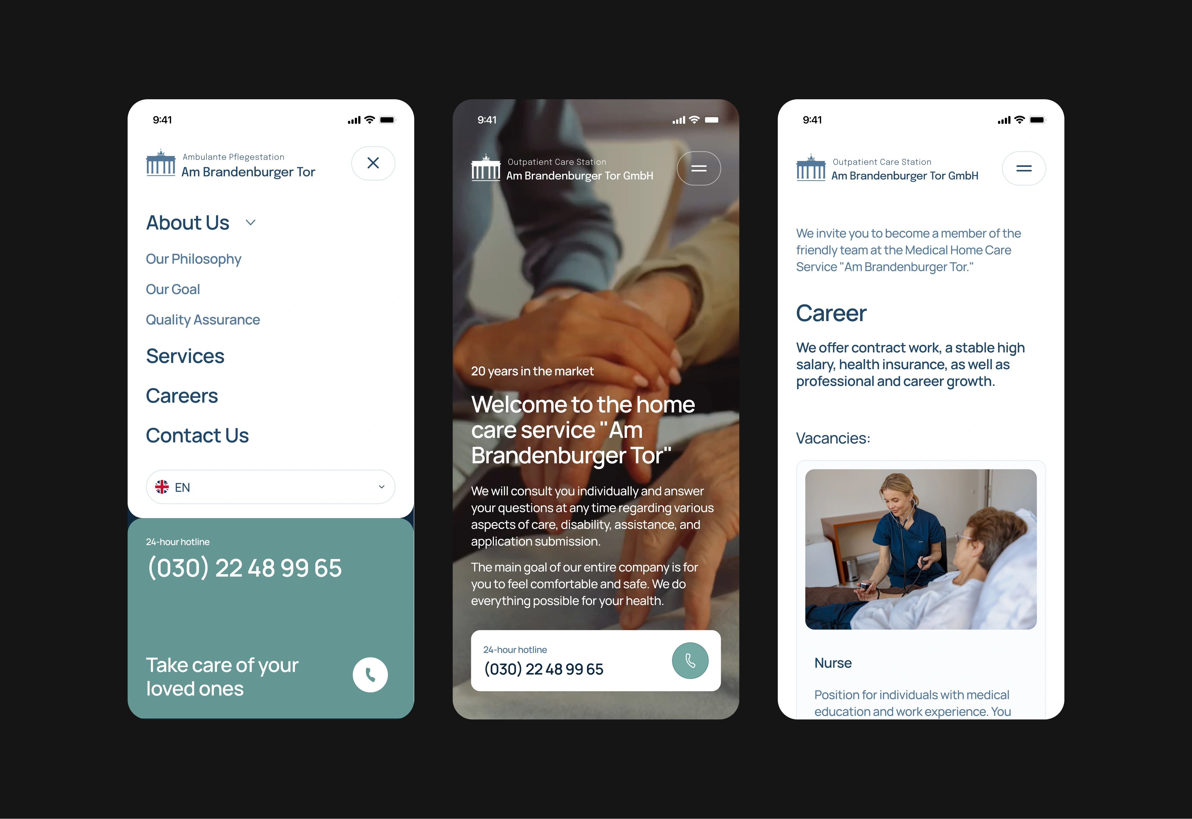
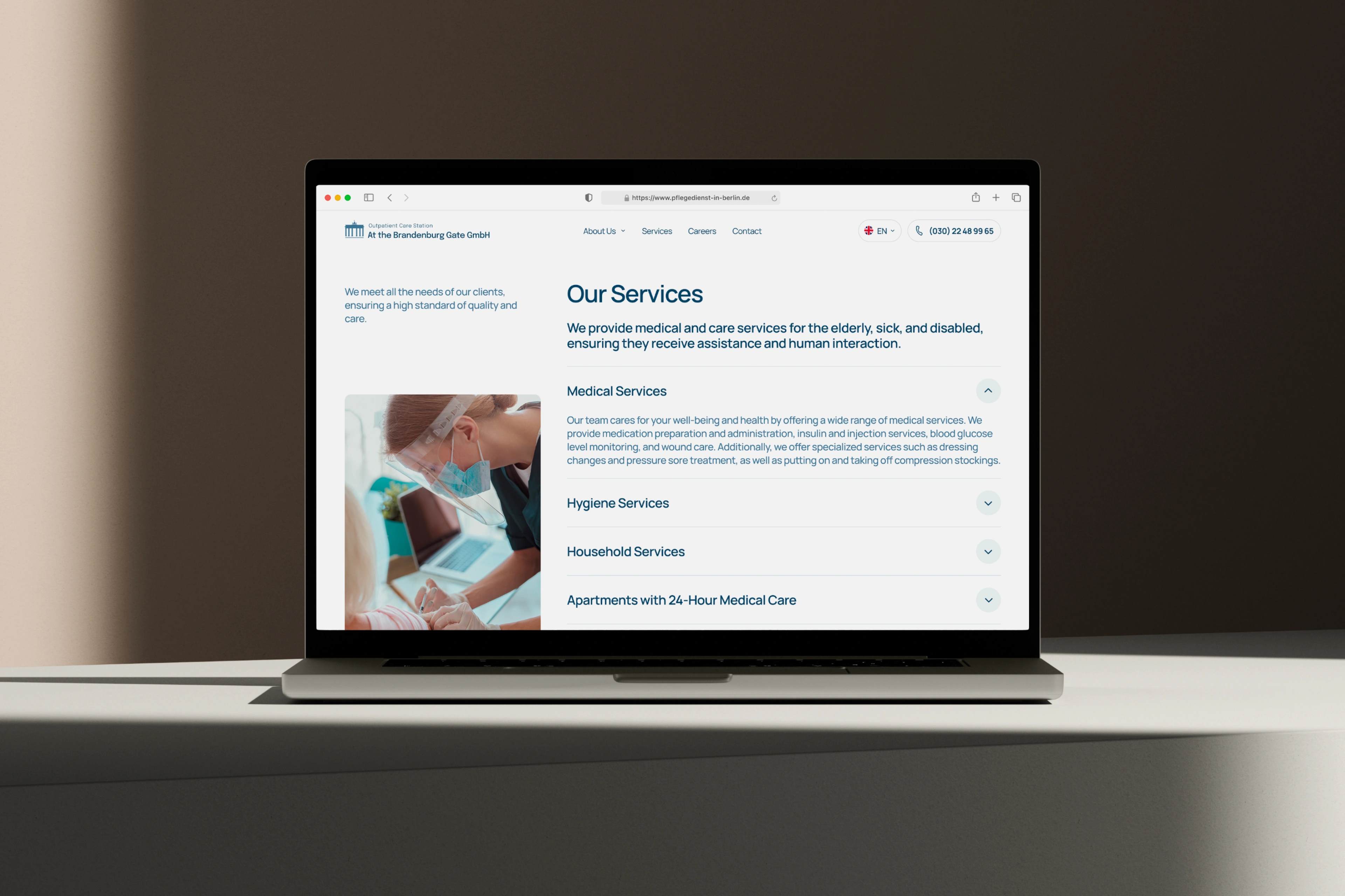
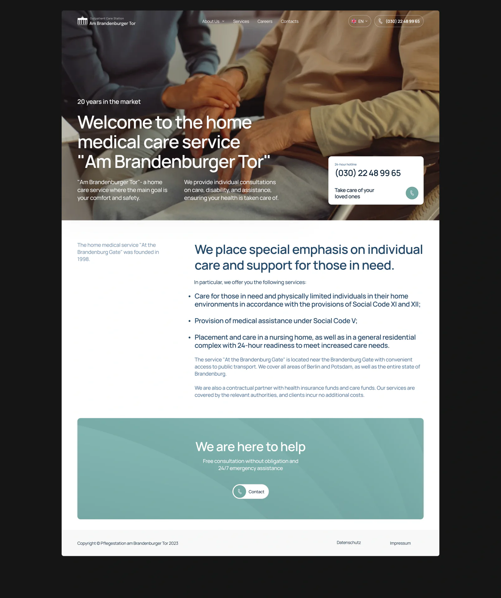
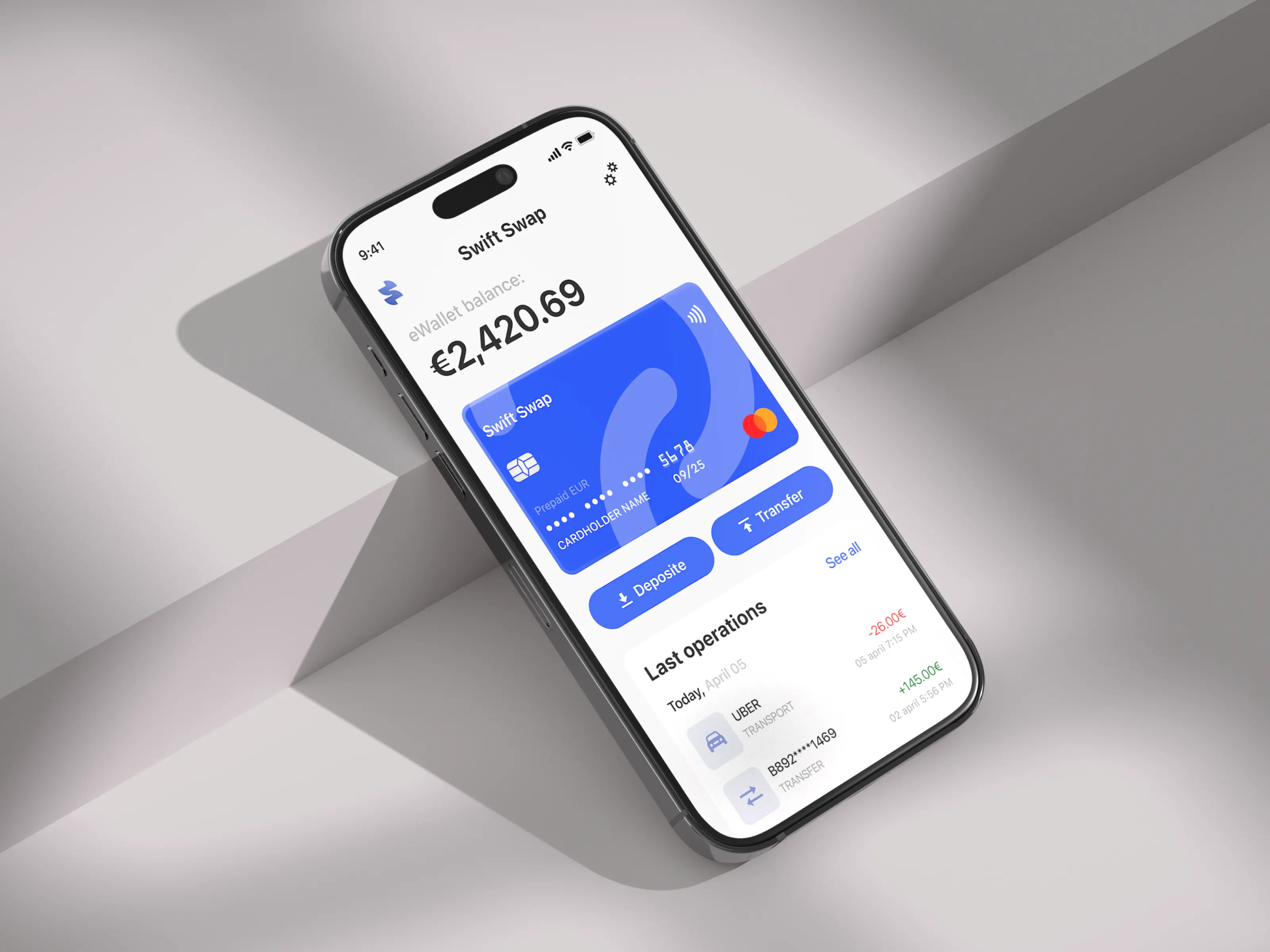
A comfortable experience for all ages
The interface was designed with a focus on simplicity, intuitive navigation, and a calm visual presentation. Soft colors, clean typography, and a clear content structure were used to reduce cognitive load and make interactions as comfortable as possible, including for older users.
The interface was designed with a focus on simplicity, intuitive navigation, and a calm visual presentation. Soft colors, clean typography, and a clear content structure were used to reduce cognitive load and make interactions as comfortable as possible, including for older users.
The interface was designed with a focus on simplicity, intuitive navigation, and a calm visual presentation. Soft colors, clean typography, and a clear content structure were used to reduce cognitive load and make interactions as comfortable as possible, including for older users.
The interface was designed with a focus on simplicity, intuitive navigation, and a calm visual presentation. Soft colors, clean typography, and a clear content structure were used to reduce cognitive load and make interactions as comfortable as possible, including for older users.
The interface was designed with a focus on simplicity, intuitive navigation, and a calm visual presentation. Soft colors, clean typography, and a clear content structure were used to reduce cognitive load and make interactions as comfortable as possible, including for older users.
The interface was designed with a focus on simplicity, intuitive navigation, and a calm visual presentation. Soft colors, clean typography, and a clear content structure were used to reduce cognitive load and make interactions as comfortable as possible, including for older users.
The interface was designed with a focus on simplicity, intuitive navigation, and a calm visual presentation. Soft colors, clean typography, and a clear content structure were used to reduce cognitive load and make interactions as comfortable as possible, including for older users.
The interface was designed with a focus on simplicity, intuitive navigation, and a calm visual presentation. Soft colors, clean typography, and a clear content structure were used to reduce cognitive load and make interactions as comfortable as possible, including for older users.
The interface was designed with a focus on simplicity, intuitive navigation, and a calm visual presentation. Soft colors, clean typography, and a clear content structure were used to reduce cognitive load and make interactions as comfortable as possible, including for older users.
The interface was designed with a focus on simplicity, intuitive navigation, and a calm visual presentation. Soft colors, clean typography, and a clear content structure were used to reduce cognitive load and make interactions as comfortable as possible, including for older users.
The interface was designed with a focus on simplicity, intuitive navigation, and a calm visual presentation. Soft colors, clean typography, and a clear content structure were used to reduce cognitive load and make interactions as comfortable as possible, including for older users.


other cases
other cases
.webp)